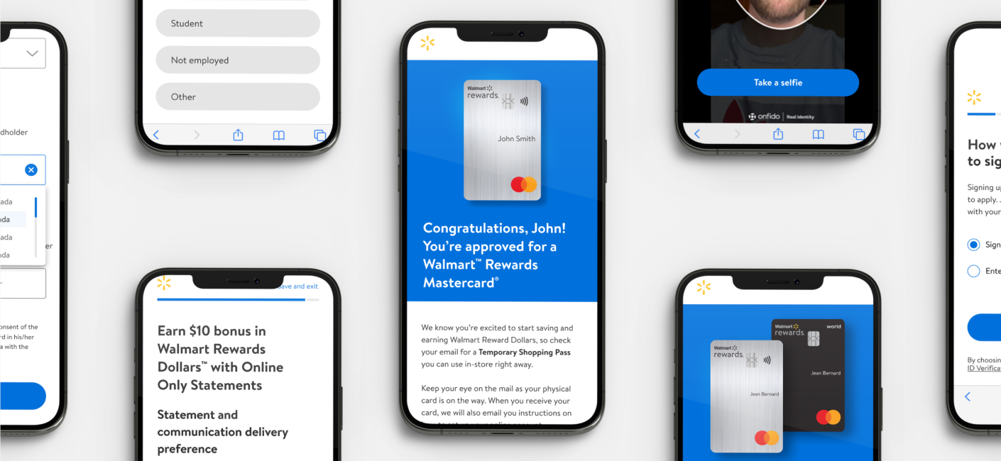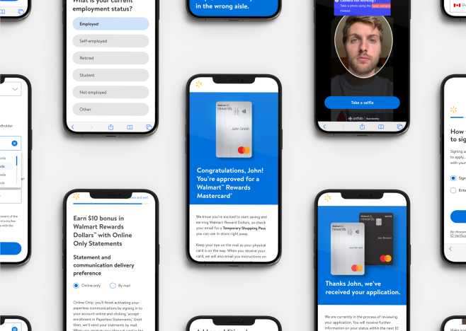
Transforming a dull sign-up into a record-breaking conversion-driver.
An uninspired application process becomes an exciting, rewarding, and frictionless experience.
RESULTS:
The final product increased paid media conversions by 89%, application completions by 66%, and calid applications by 52%.
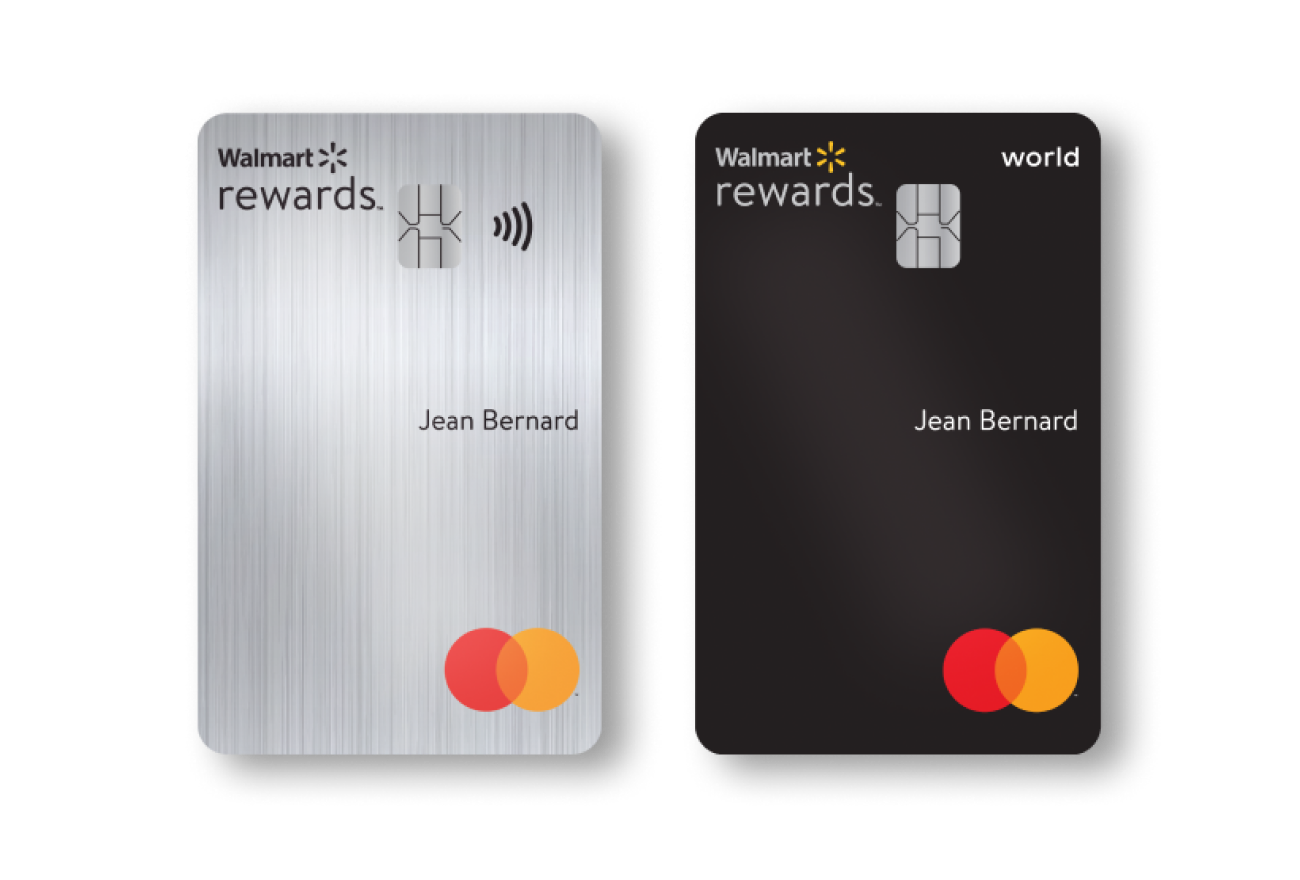
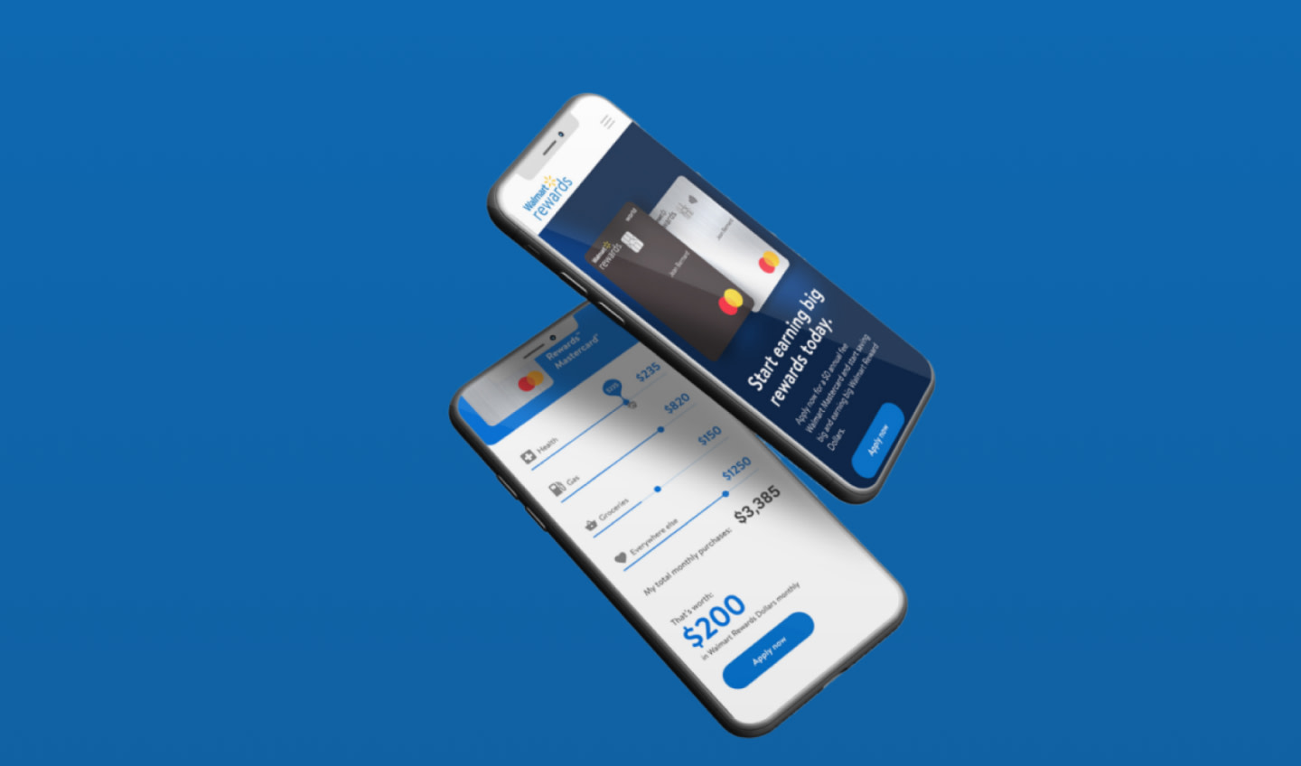
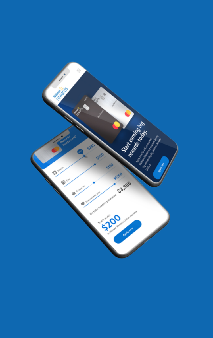
When Walmart and Fairstone Bank came to us, their rewards Mastercard microsite was in need of key improvements. The application was confusing to navigate, didn’t match the Walmart brand, and wasn’t hitting conversion targets. Fairstone knew they were in need of change, and we knew how to get them there.
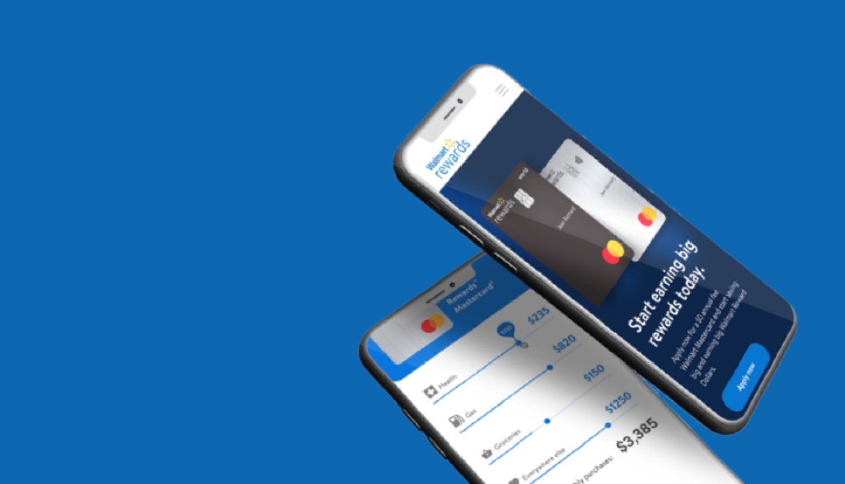
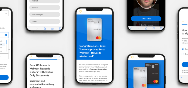
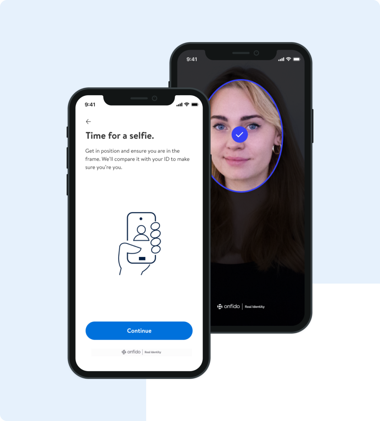
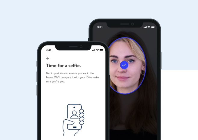
We partnered to simplify the sign-up process and better communicate the brand. Our vision was to create a user experience that was more conversational, inviting, and human – far from the stiff legal form it once was.
Our rebuild integrated in-depth backend APIs with session management, user databases, and credit bureau coordination, all in a headless CMS. The new stack has the flexibility to add additional features as needed, like promotions and cross-marketing, keeping the platform synchronized and agile.
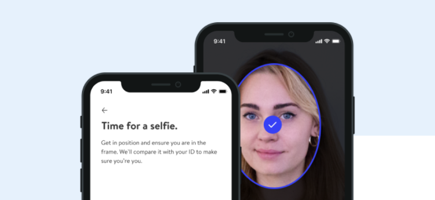
In just one month, marketing clicks increased by 89%. The new UX and identity validation initiatives also led to completion and approval rate increases of 66% and 52%. We sought to create an engaging experience that people want to use, and the proof of our success is in the numbers.
