Revolutionizing heart health by reviving a struggling app.
Reworking UX, DevOps, and content management to lead in the Medtech space.
FEATURES:
The final app was launched 9 months ahead of client’s initial estimates.
This healthcare client struggled to meet patient and caregiver expectations due to outdated technology and a poor user experience. To regain trust in the healthcare community, they needed to demonstrate their commitment to valuable medical innovations.
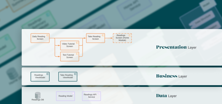
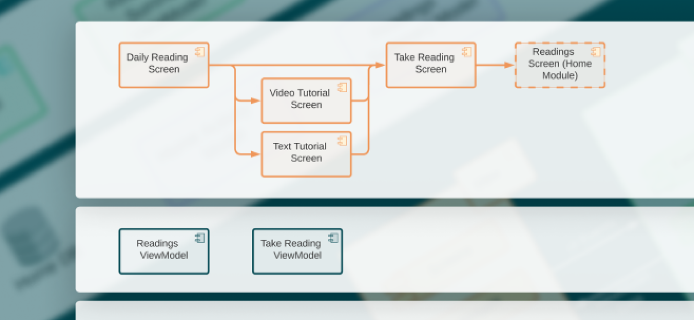
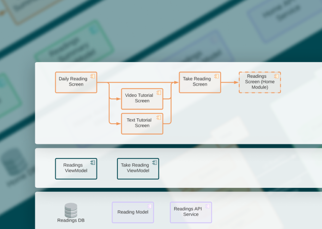
Through collaboration led by Thrillworks, we conducted a technology audit and built a proof of concept that demonstrated the capabilities of our recommended tech solution. Together, we transformed a struggling cardiac app into one that exceeded patient and caregiver expectations, with further plans for improvement.
What We Did:
Development-ready UI and copy
Functioning software
Analytics engine
We reimagined the innovation process, implemented a modern user experience, and leveraged technology to support future enhancements, including better integration with caregiver services.
In just two months, nine months ahead of the client’s initial estimations, we launched an enhanced parity app that delivered the experiences patients truly desired.


